Lighting can be a very difficult aspect of video production to master. I want to go deep on showing you a simple video interview lighting setup, both working with natural light and lighting it from the ground up.
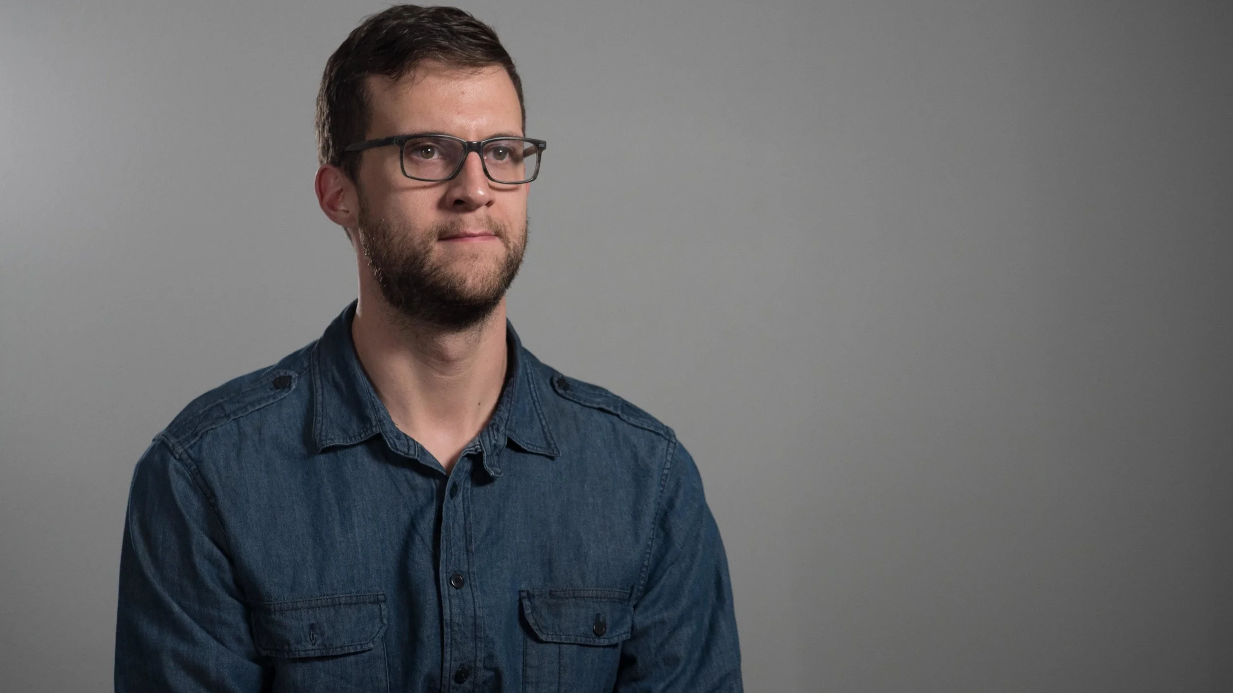
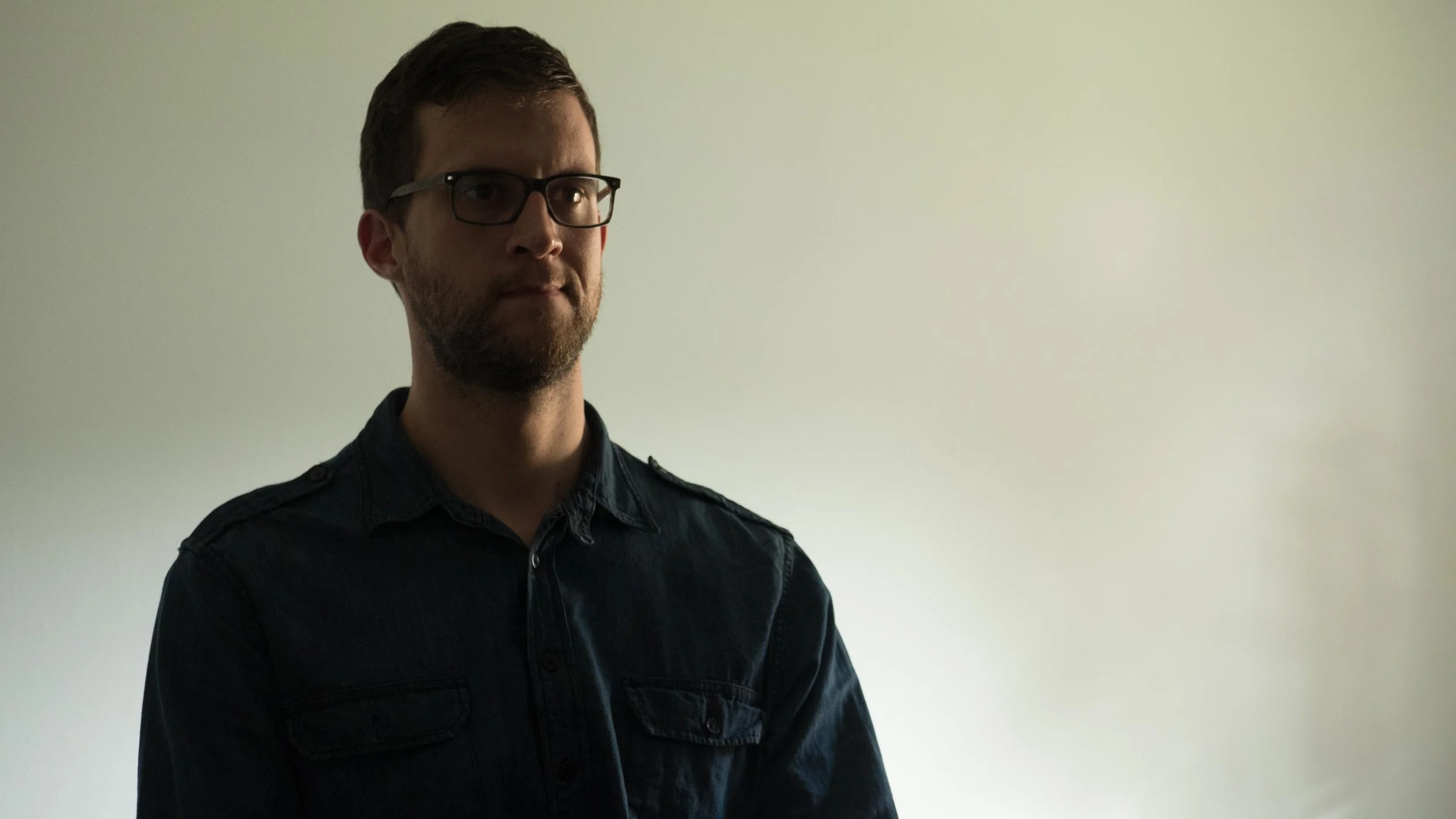
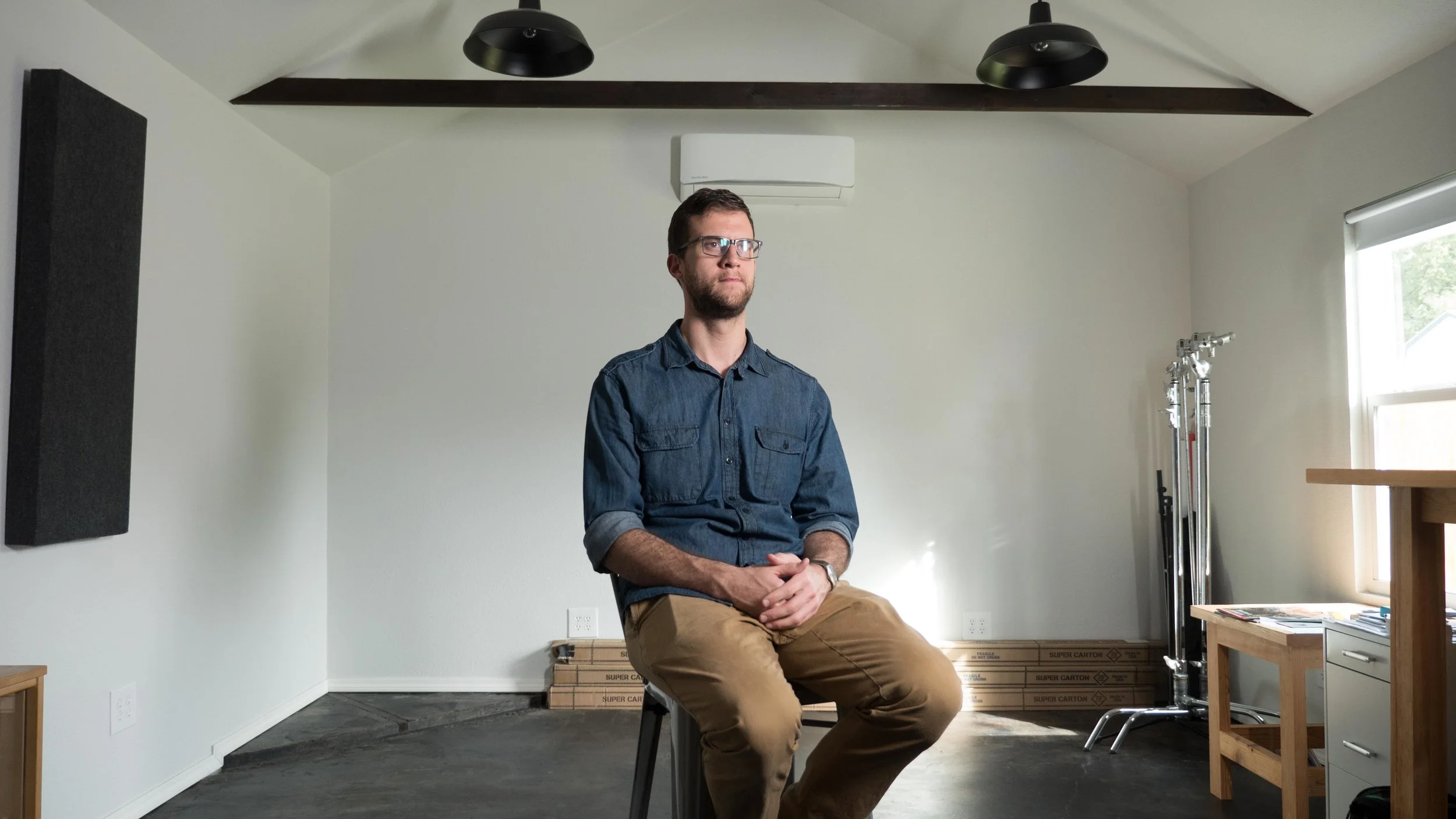
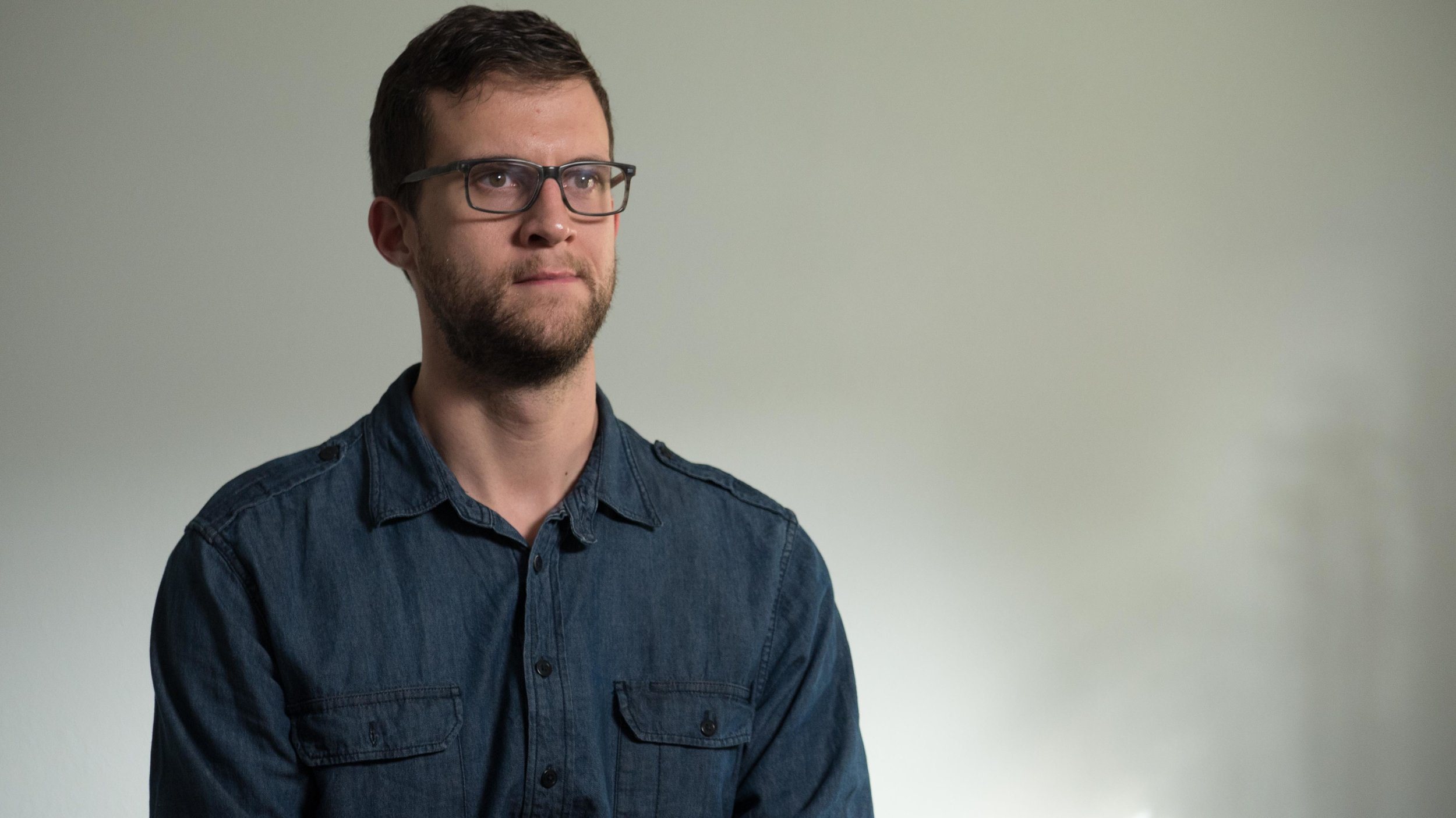
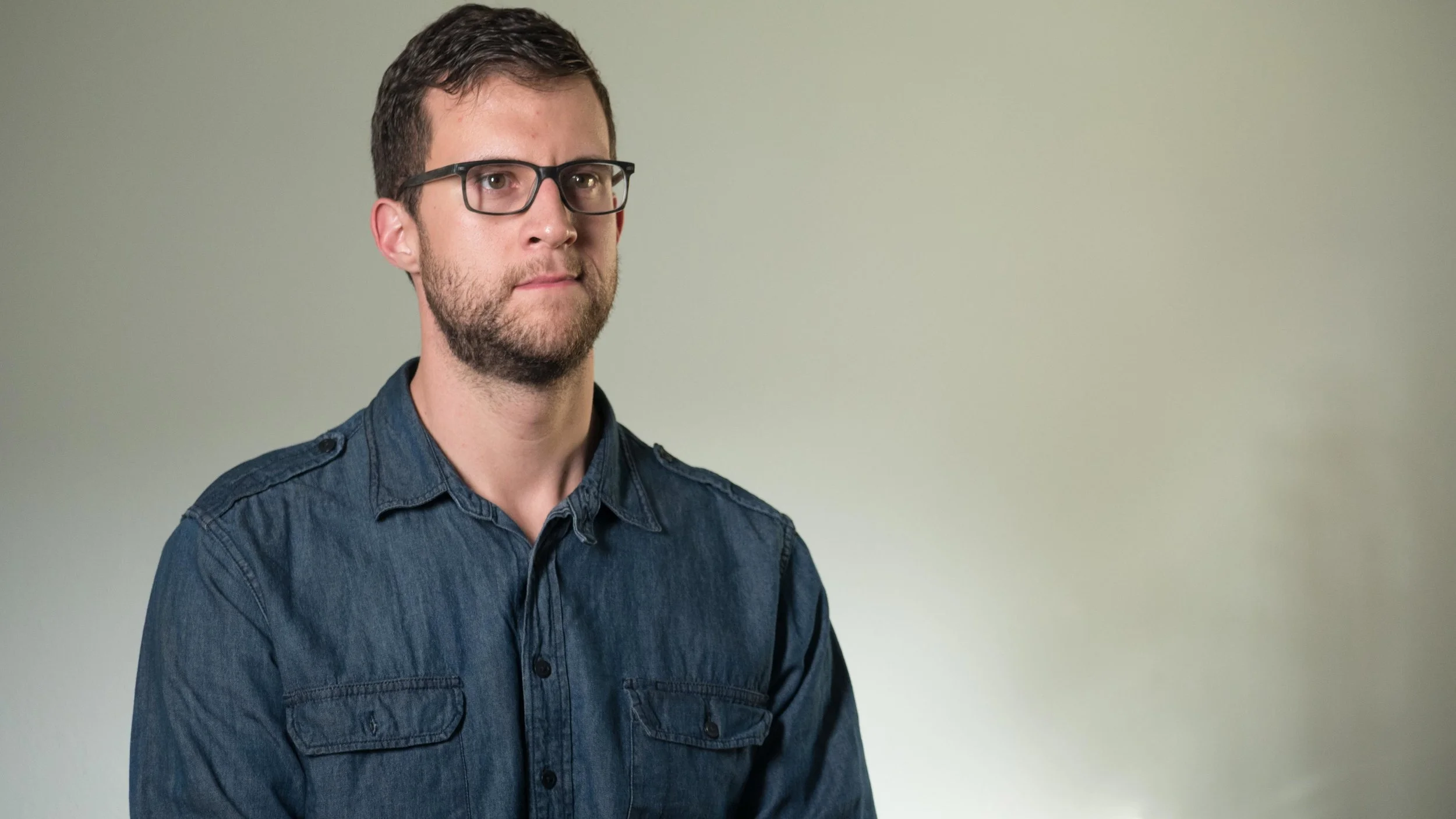
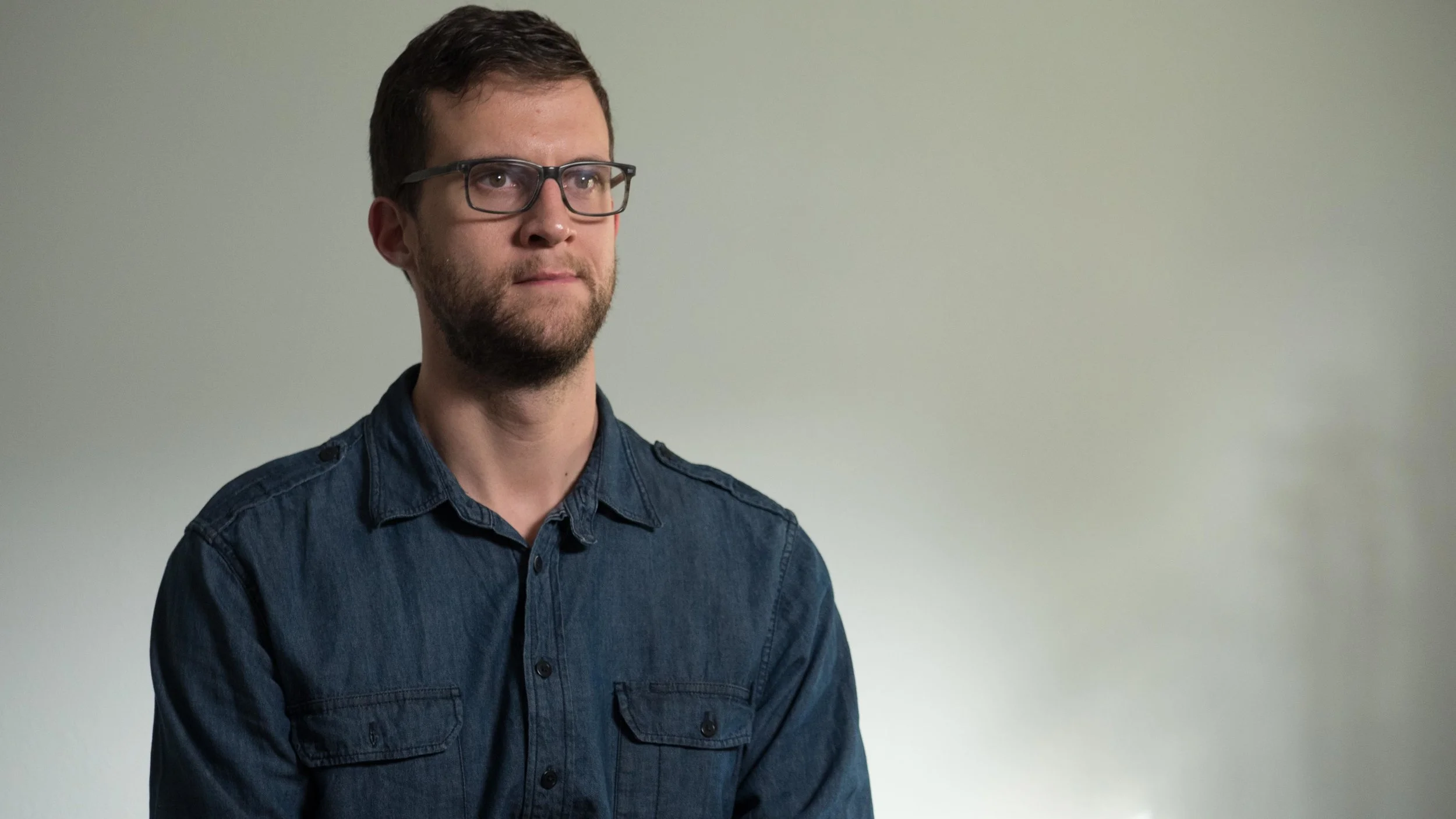
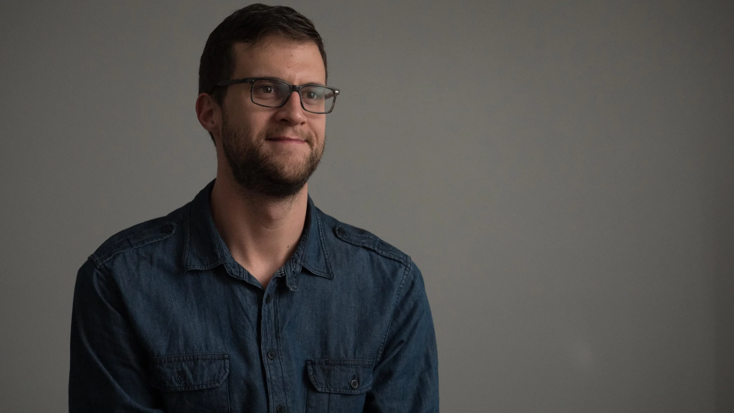
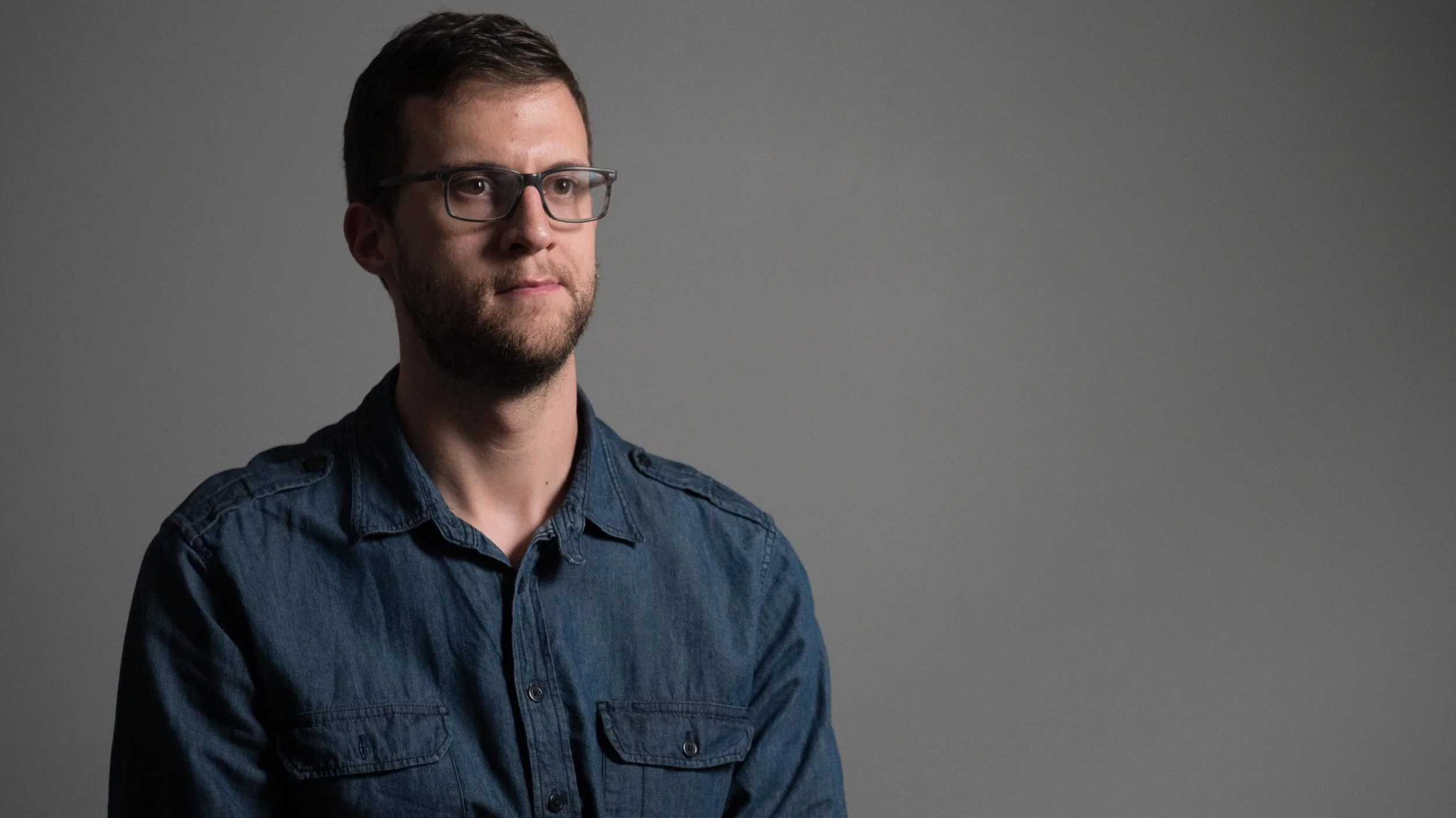
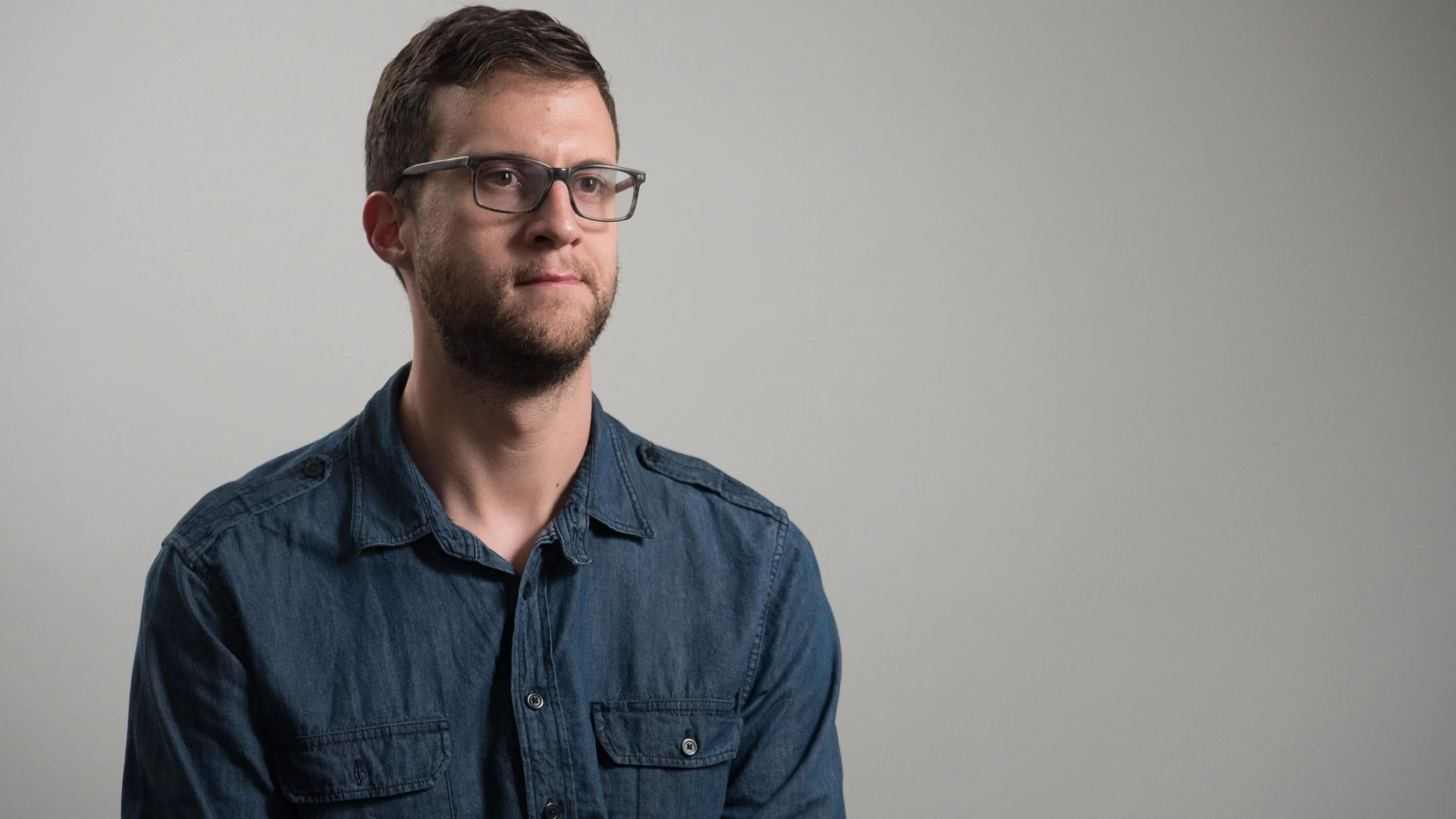
Here's how to setup lights for an interview that looks like this:
Step 1 – Eliminate a Light Source
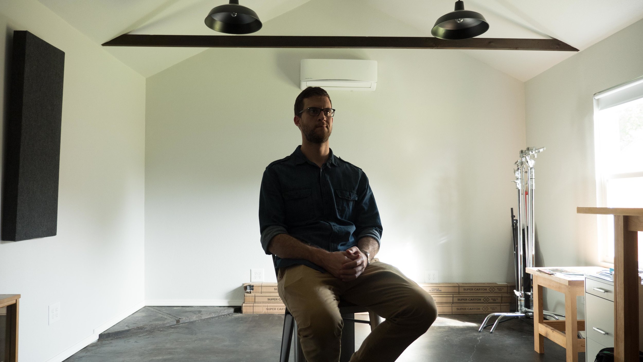
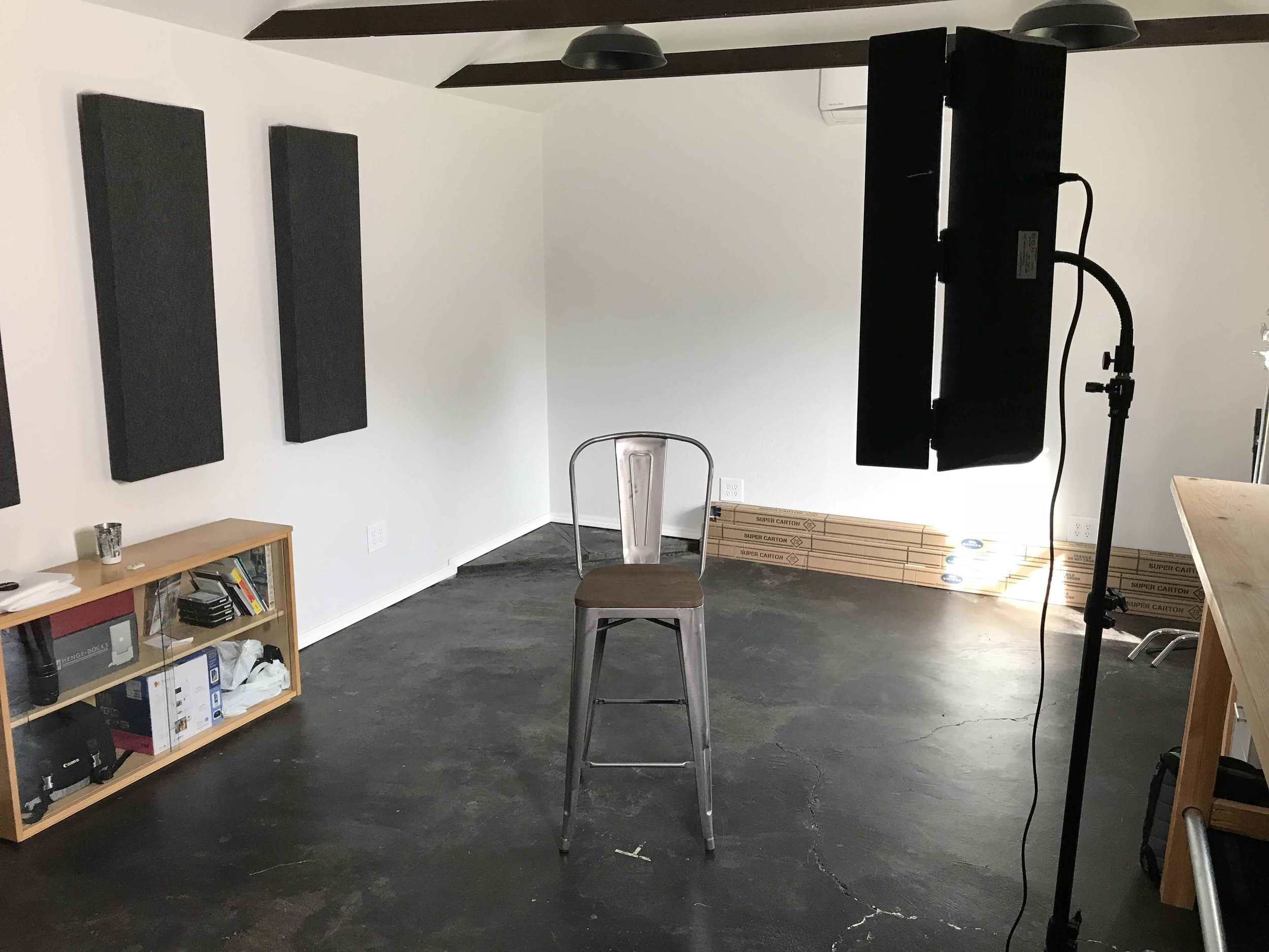
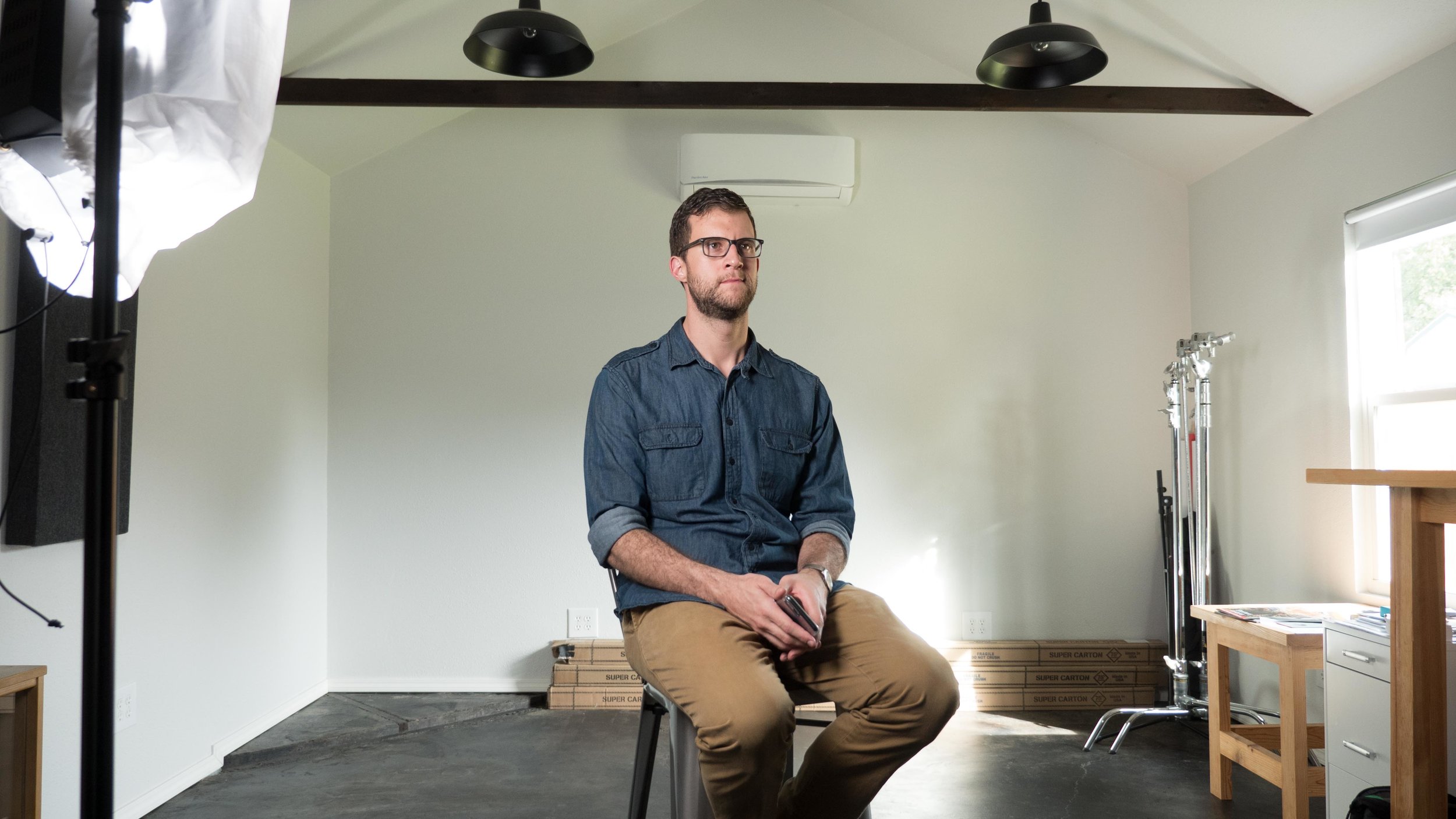
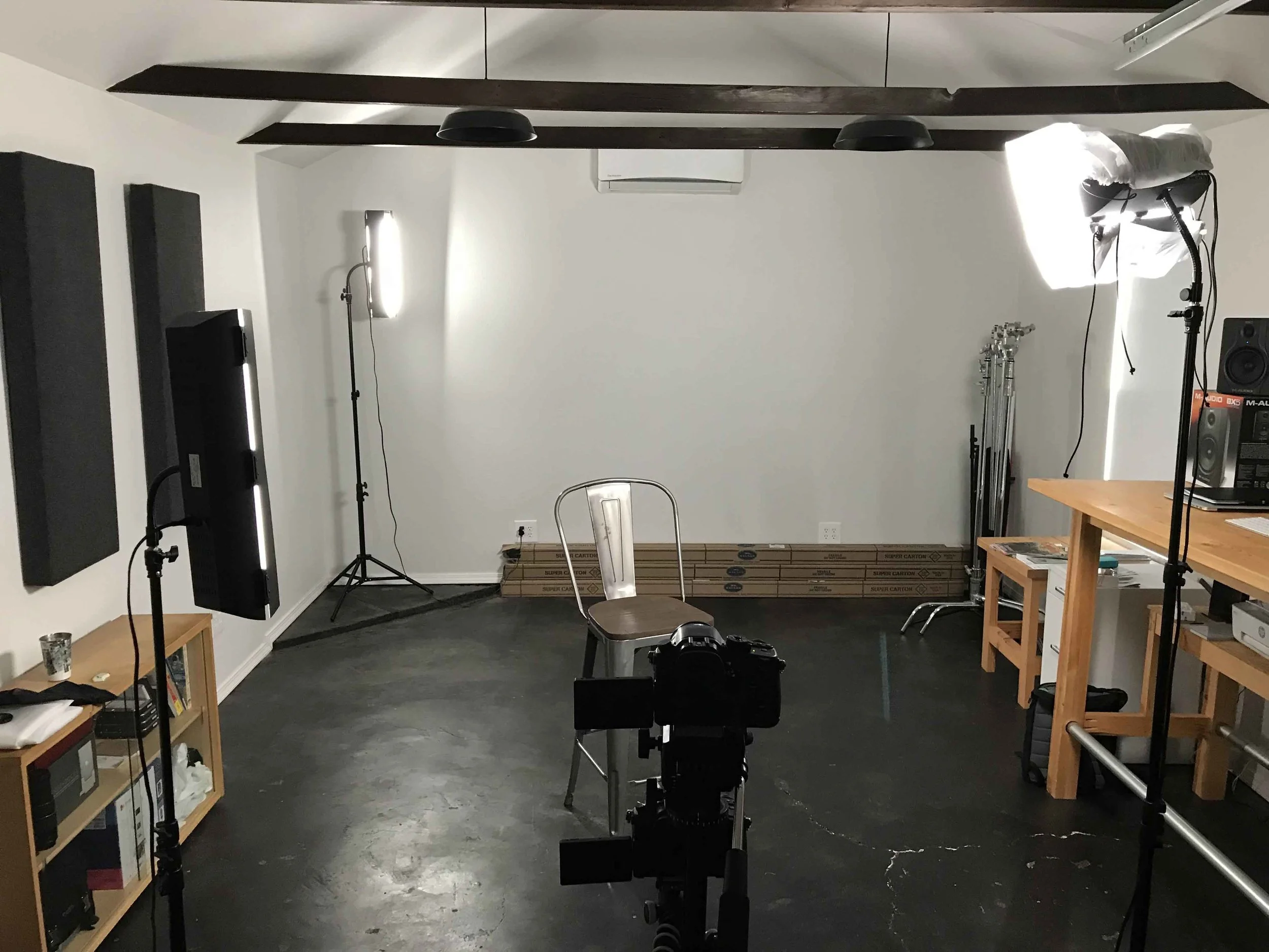
Let's go back to the beginning. Here's the room we're working with.
Like most rooms you will encounter, there are exterior windows and interior lights. These two light sources usually emit two different colors (or temperatures) of light.
The window is putting off daylight at roughly 5600K which is more blue. The tungsten light bulbs are putting off light at approximately 3200K which is more orange.
Because they're two different temperatures, you don't want to have them both on at once.
(This is usually when someone at the shoot asks, "You're turning off lights for pictures?!" To which you smile, bite your tongue about the fact that the "pictures" you're shooting is actually video footage, and reply with all the restraint you can muster, "Yep!")
If you don't know it by now, your camera has a setting called white balance. It's the color that your camera perceives as white and it changes in every setting.
Since there are two colors of light in this scenario, and since you have to tell your camera to pick one, you need to get rid of one. Either the cooler 5600K or the warmer 3200K. If you don't, your camera will exaggerate the other color and the image will be gnarly.
Look at the following example. The only difference between these shots is the white balance setting on the camera. All the lighting is the same.
PHOTO 1
WB: Daylight
Shutter: 1/50
ISO 800
f/2.8
PHOTO 2
WB: Tungsten
Shutter: 1/50
ISO 800
f/2.8
PHOTO 1 – The color of the light on the lower back wall looks okay, but the tungsten light in the scene is too orange. The stronger the tungsten light, the worse it looks. The front of the face, which is the most important part of the image, is the worst part. I look like an overly-enthusiastic retiree after their first week of living in Florida.
PHOTO 2 – When we switch the white balance to tungsten, the very front of the face may have a better color (though it's obviously under exposed), but it's hard to even see that because all the ambient daylight surrounding the subject is so blue.
WHEN YOU HAVE MIXED LIGHT TEMPERATURES, THERE IS NO CORRECT WHITE BALANCE SETTING.
Here's what happens when we turn off the interior, tungsten balanced light.
WB: Daylight
Shutter: 1/50
ISO 800
f/2.8
WB: Daylight
Shutter: 1/50
ISO 800
f/2.8
Obviously our image is still too dark, but we've eliminated the problem of have two competing color temperatures. It already looks better in terms of color.
Why not use the overhead lights and eliminate the daylight from the window?
Typically, bulbs from the ceiling don't look great on camera because of their direction and softness. Coming from above, they create unflattering shadows on your subject's face. Soft light coming from the side emulates what our eyes see near windows, such as inside a house in the day time, and it's a look that's often used in movies.
As a matter of principle, it's a good idea to try to work with the natural light you have before you work against it. I'll demonstrate this below.
Let's add some lights to start making this setup come to life!
Step 2 – Add a Key Light
WHAT YOU NEED IN A LIGHT KIT.
Before we start adding lights, we need to spend some time answering everyone's favorite question: "What gear do you use?"
There are a lot of things to consider when buying a lighting kit.
Light quality.
Budget.
Tungsten, fluorescent, LED, HMI, CFL.
Portability.
You can spend hours and hours and hours researching your light kit. If you want to do that, I won't stop you. Sometimes you have to in order to feel peace of mind.
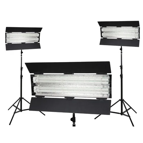
If you don't want to do that, here is the light kit I settled on after doing my own hours upon hours of research.
This is a beginner light kit. It's not top of the line and you probably wouldn't see it on a Hollywood set. It has strengths and weaknesses like every other kit. There are many other comparable kits. For the price point I think it's pretty great. It's not top of the line, but it's a solid starter-to-mid-range kit.
The reasons I bought it:
The light is soft.
The light is bright.
Included bulbs are daylight-balanced (5400K).
There are three lights in the kit, with stands and a carrying bag.
It's an affordable kit considering all the features.
I ended up adding accessories of my own to make this kit even better:
(2) Kino Flo Full Floziers - Wraps around the front of the light to diffuse it.
(6) Kino Flo 3200K Bulbs - This give me the option of having both main light temperatures at my disposal, which is very important.
Kino Flo 6-Lamp Carry Case - For holding the bulbs that aren't in use.
(3) 0.6 Neutral Density Sheets (21" x 24") - These can't be dimmed, so ND sheets bring the light level down in the situations when you can't move the light further back. Just attach them to the front of the light with clothespins.
Cinefoil - To further shape and control the light.
This brought the total up to $1,215.78. Though that's about double the price of the kit, it's a pretty reasonable price for such a complete light setup. You don't have to have all those accessories to get started. The only accessory from the above list I used in this post is a single Kino Flozier.
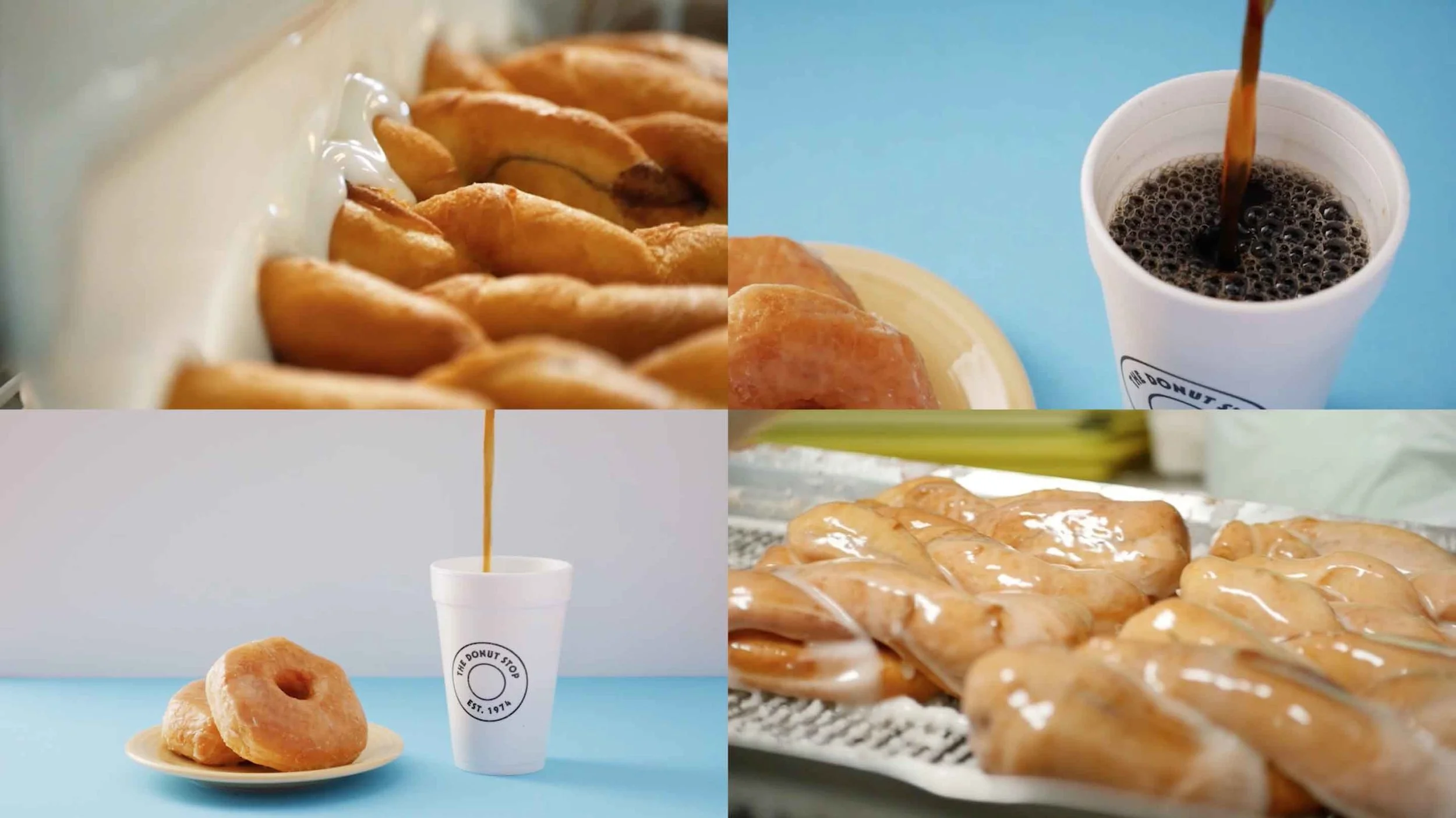
Here are some shots I've lit with this kit.
It actually doesn't matter too much which light kit you use. You just need a light that is:
Bright.
Diffused.
The right color temperature.
You could accomplish this with a homemade kit from Home Depot if you need to.
Simple clamp lights with tungsten bulbs and daylight balanced CFL bulbs would be a good start. And you can diffuse the light with wax paper, or with a shower curtain from Walmart.
Theres a stellar tutorial for that over at Wistia.
Key Light - Option 1
Now that I've turned off the room lights, I'll add one of my lights on the subject. (It's an interesting feeling calling yourself "The Subject.")
The only light source here is a little window in the back.
WB: Daylight
Shutter: 1/50
ISO 800
f/2.8
Now I'll add one of my lights. The bulbs are 5500K, so they match the light coming from the window.
WB: Daylight
Shutter: 1/50
ISO: 320
f/2.8
Notice how even though my face is lit better, the room behind me is a little darker. Why is that? I changed the ISO from 800 to 320 to expose properly. Since most of the light I added was on my face, when I darkened the exposure to match the light on my face, the room behind me became darker. You can see it more clearly below.
ISO 800
Light added. ISO 320.
This is the only light that I added to the setup.
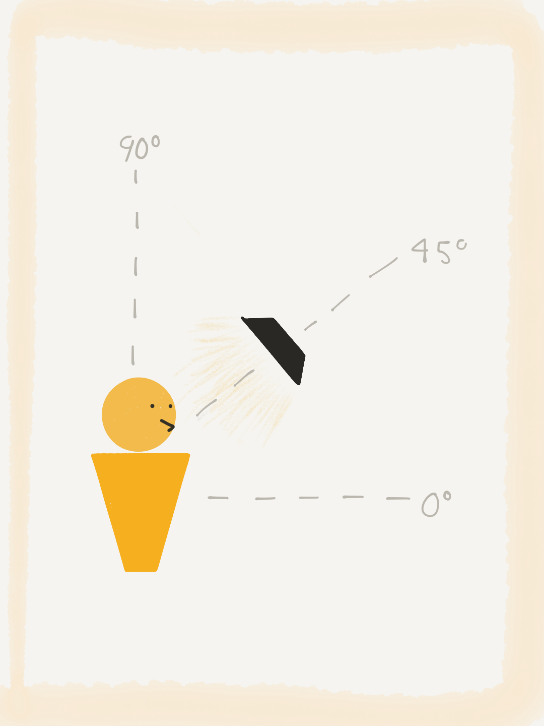
As a rule of thumb, it looks good when your subject is looking somewhat towards your light source. So I usually start with the key light about 45º to the side, and 45º up from the subject's face.
45º over
45º up
You can see I didn't place the light correctly and the reflection in my glasses is very distracting. So I'll raise the light a little higher to reduce that glare. Remember, the 45º rule is only a starting point.
I'll also add a Kino Flozier to the light to diffuse it, one of the accessories I mentioned earlier.
ISO 640 (Without the flozier it was 320)
Much better! This will be our main key light setup for the example I'm showing you.
Kino Flozier added to diffuse the light.
Much better! This will be our main key light setup for the example I'm showing you.
We could definitely work with the natural light in the background and make this our shot as it is, but I want to keep going. I want to take away the natural light and show you how to light the whole shot using only your lights.
But before I do that, let me show you a couple other options for using one light only in this setup.
Key Light - Option 2
There is some wiggle room for creativity in your lighting setup. I struggle saying that because I don't want you to settle for bad lighting and call it creative. Still, there is more than one way to frost a cookie.
Here's what happens when we take our light and move it to the other side of the camera, 45º on the other side of the subject.
Isn't it interesting how light placement can make such a different look? I've added nothing to this shot, only moved the light to a different spot in the room.
As you look at the before and after, consider a few things:
The second shot looks good, but it seems more obvious that there's a light just off camera. It seems a little more artificial. Not as motivated or cinematic.
The second shot is better as far as the glare on the glasses go.
On the second shot, the shadow being cast by the glasses between the frames and eye on the left side of the face is distracting.
I personally think the first setup looks better, but it's a matter of opinion. The way the shadows fall on the left side of the face is flattering. It almost feels like it's coming from a window.
Key Light - Option 3
Let's use our single key light one more way while keeping the natural light in the background.
I happen to have white walls surrounding me in this shot. This means I can point my lights at the wall and create a bounce light.
Here's what happens when I take my single light, remove the flozier, and point it right at the wall to the right of the frame.
WB: Daylight
Shutter: 1/50
ISO: 1000
f/2.8
See how much softer the light is on my face? The only problem is, there's less of it, so I have to gain my ISO up to 1000. On the GH4 this makes me a little nervous, but it is still useable.
Here's what the light looks like.
I think this option is the most cinematic of the three. It feels like there's another window off camera, which is great.
Quick review, the three options with a single key light and natural light in the background.
Option 1
Option 2
Option 3
Step 3 – Eliminate the natural light.
So far I've shown you how to work with natural light along with light sources of your own that having matching color temperature.
Let's look at an interview lighting setup with only 3 artificial lights.
If I shut the window, look at how it transforms the 3 options from before.
Option 1
Option 2
Option 3
Crazy, right?
The drama is starting to set in thick. I really like the look of Option 3, but again we're looking at an ISO of 1000, which is a bit noisy on the GH4. It's also pretty dark and moody, so it may not be best for your video depending on the story.
For now, let's go back to Option 1 since this is the look I've promised to show you how to build.
Step 4 – Add a fill light.
We have our key light up with a flozier. Now let's add some light to the other side of the face.
The mistake many people make when adding a fill is that they make it too bright and eliminate all the shadows. I think having some shadows on the face is a good thing, so I'll be taking a more subtle approach.
Key Light only.
Fill Light added.
This may be so subtle you can't see it. Notice the extra light in the ear. Also notice the second tiny reflection of light in the eye.
Here's what the set up looked like.
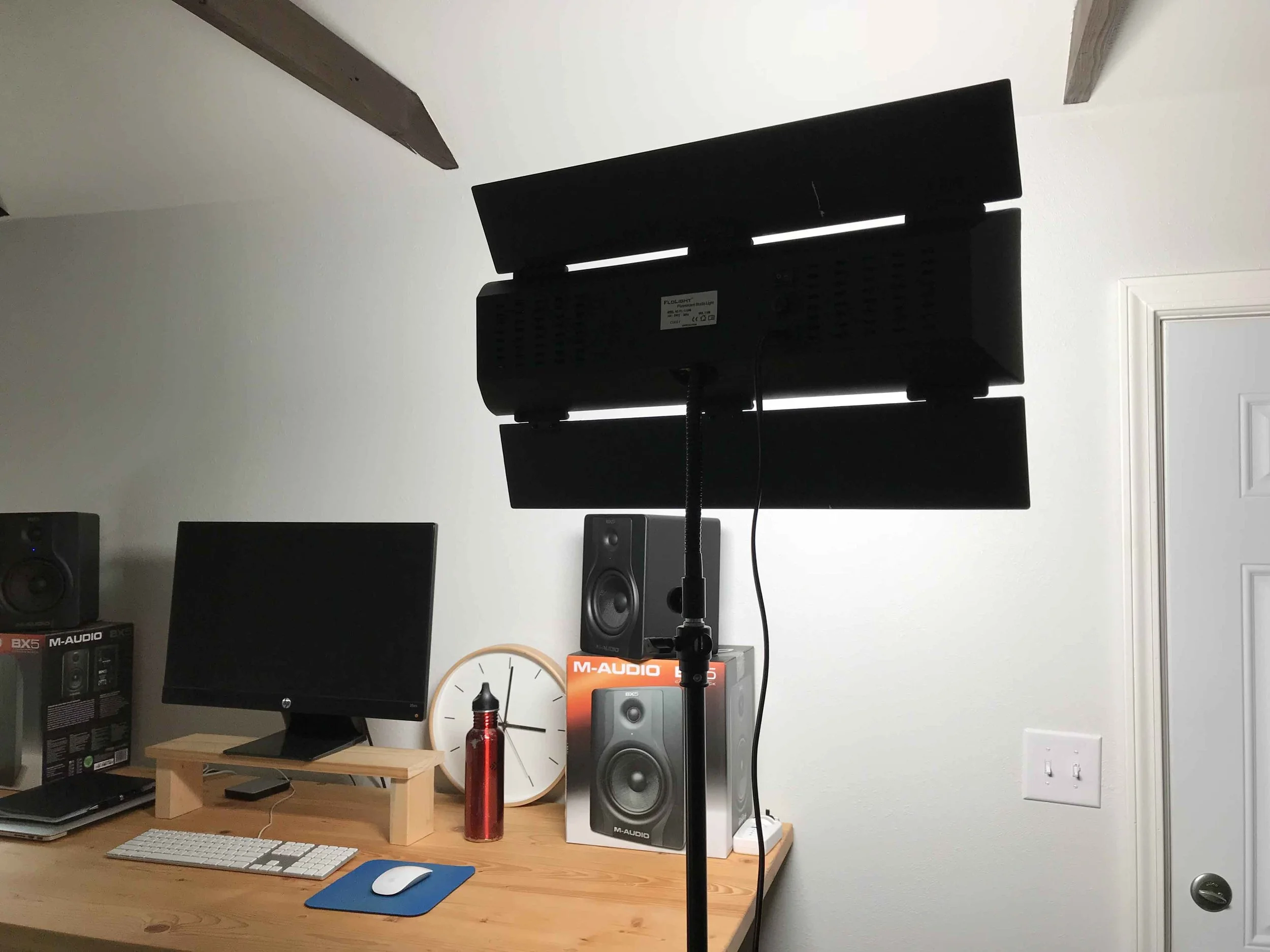
The barn doors on the fill light are pinched almost completely shut. Even though these lights can't be dimmed, you can still control the light quite a bit with just the barn doors.
Step 5 – Add a rim light.
The Rim Light is also sometimes called a hair light. The light helps add dimension to the shot and accentuates the outline of the body.
Here is where we left off.
Key + Fill
Key + Fill + Rim
View of the arrangement.
I have the barn doors almost completely closed on the rim light. It's also really far back.
Typically once my key light is in place I try to build the other lights around it. If the fill or rim lights are too bright, I adjust them first before changing the key. This gives me a good baseline.
If I really wanted to clean this shot up I would block off the light that is coming off the back light onto the wall. For now, it doesn't bug me.
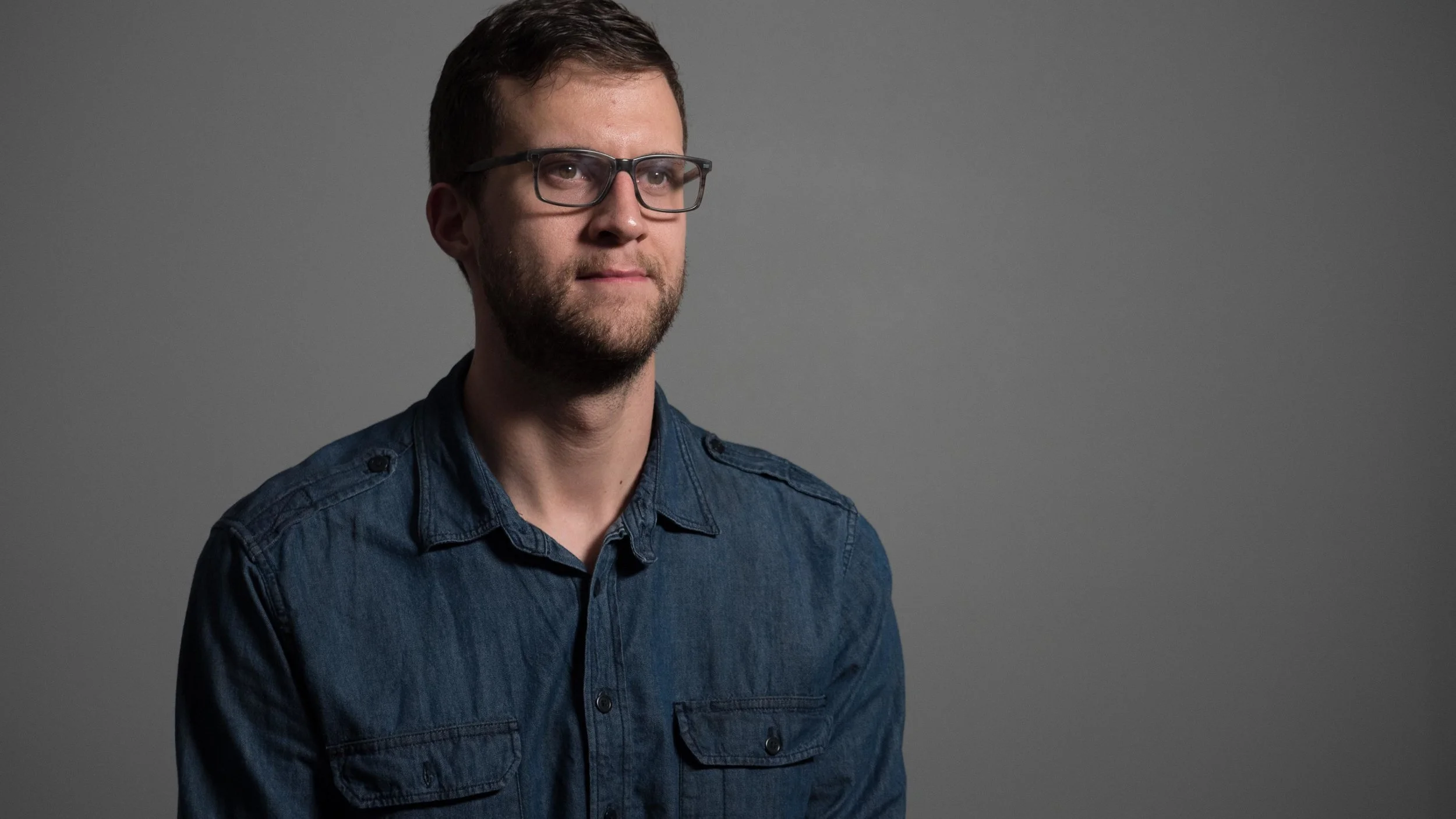
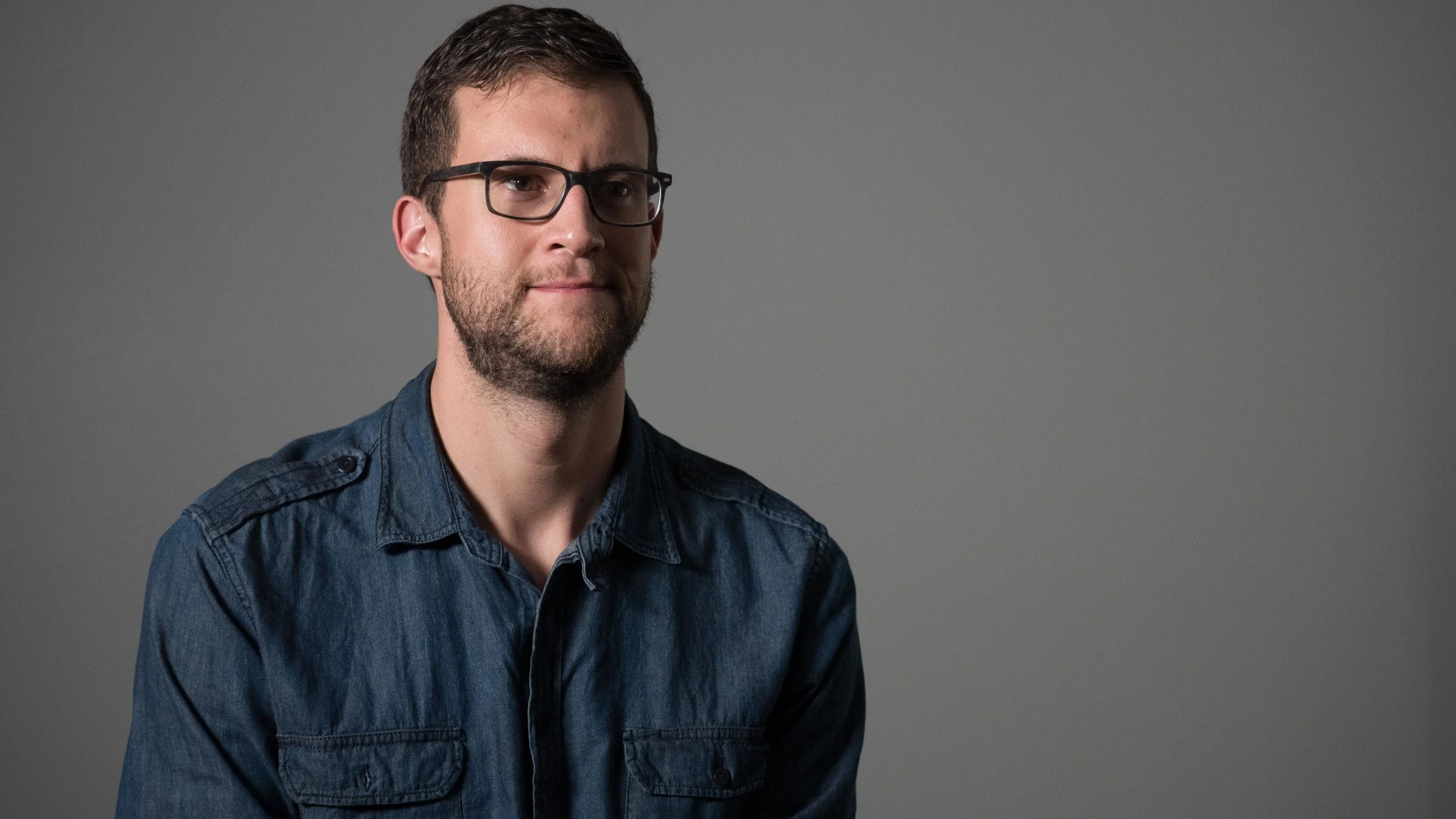
So there you have it! That's the setup.
Key
Key + Fill
Key + Fill + Rim
BONUS
Free 3-Point Lighting Diagram
A simple map of a pro lighting setup you can use on your next interview shoot.
Extra setup – An even softer approach.
Just for kicks, I decided to turn all the lights around and bounce them.
The Key was bounced off a poster board on a c-stand, and the Fill and Rim were bounced off the walls.
Here's the original.
Original setup.
Here's the bounced version.
Each light bounced.
Here's the result:
Take away the fill.
Take away the rim light (which is also heavily illuminating the wall).
I could see first shot being a light hearted testimonial for a mobile app. The final option could be a serious documentary. The second option is a nice in between.
Final look at the two artificial setups.
Lights pointed at subject, diffusion on key light.
Lights bounced.
Did you miss it?
Here's the free lighting diagram for interviews.
It helps so much to have a blueprint on shoot day. Keep your mind focused and knock out your next setup like it's your job.
Get yours below!
