Seeing great video work inspires me deeply. It sets my mind and creativity in motion.
So I want to think out loud for a minute. I want to share a video I find inspiring and tell you what goes through my head when I see it. It's an invitation to look at the video through my eyes.
Maybe you'll learn something as I observe and point out what's already there.
In this post I want to break down exactly why I think "Vero - True Story" is a good video. If you haven't seen it yet, take 2 minutes to watch True Story below.
Pretty sweet, right?
Here are 6 reasons why Vero - True Story is a good video.
1. It makes me understand the product.
How many videos do you see where you aren't really sure what's going on? I feel like they're everywhere.
The people who made this video understood that the message of the video is the priority. If they spend hundreds of hours brainstorming, planning, scheduling, and executing a beautiful video that doesn't make sense to the viewers, it's a waste of time. It may be art, but it wouldn't be an advertisement.
Think about it. Why would a business like Vero want a video? More specifically, why would they spend a ton of money for a video? To sell more. And while I can't speak for the masses, this video immediately made me understand the product. By the time it was over I wanted to join.
I appreciate the fact that a video can be so filmic and yet so unmistakably clear in its main point. Most of the video is showing the app itself.
2. The images are beautiful.
It takes less than a second to realize this video is top notch. The first three time-lapse shots of the city at sunrise are a perfect way to set the tone for the rest of the video.
It looks like a film, but communicates like a corporate video.
The interaction of the motion graphics with the live footage feels very organic throughout. Not forced, but like they're part of the scene.
The people and the settings are broad and diverse, yet it's consistent in its urban feel.
3. The city is a great analogy for social media.
Perhaps most importantly, this video communicates how social media feels. Social media is a very busy place with seemingly endless amounts of information. It's hectic, it's crowded, it's messy–yet it's organized. It's always moving. It's stuffed with people, both friends and strangers.
A city is a perfect analogy. It wouldn't make sense for the video to be set in the wilderness.
4. Sound design.
Pretty much every video that moves me is an ace when it comes to sound design.
Foley – Notice the ambient sounds that go with the city shots. Subtle and realistic. Notice also that not every part of the video needs foley added. (Foley = relating to or concerned with the addition of recorded sound effects after the shooting of a film.) There are several scenes where I would assume they would add sound, but they don't.
Music – I'm super in love with the music on this spot. It's one of the strongest elements. The energy! Again, the music element coincides with the theme of urban busyness. Maybe more than that, it makes me feel that Vero is something I need to check out. Is it weird that I got FOMO just from hearing it? I don't want the world of Vero to leave me behind because it feels like it's going somewhere.
VO – No doubt the script is rock solid on this spot (more on that below). But it was delivered beautifully. Notice that the words are razor sharp and intentional, yet the actress is speaking as if you're in her living room. It's relaxed and authentic. It doesn't feel forced. Her tone is excellent, as is the EQ on her voice and overall recording quality. She has authority in the video, but she's laid back too.
5. Attention to detail.
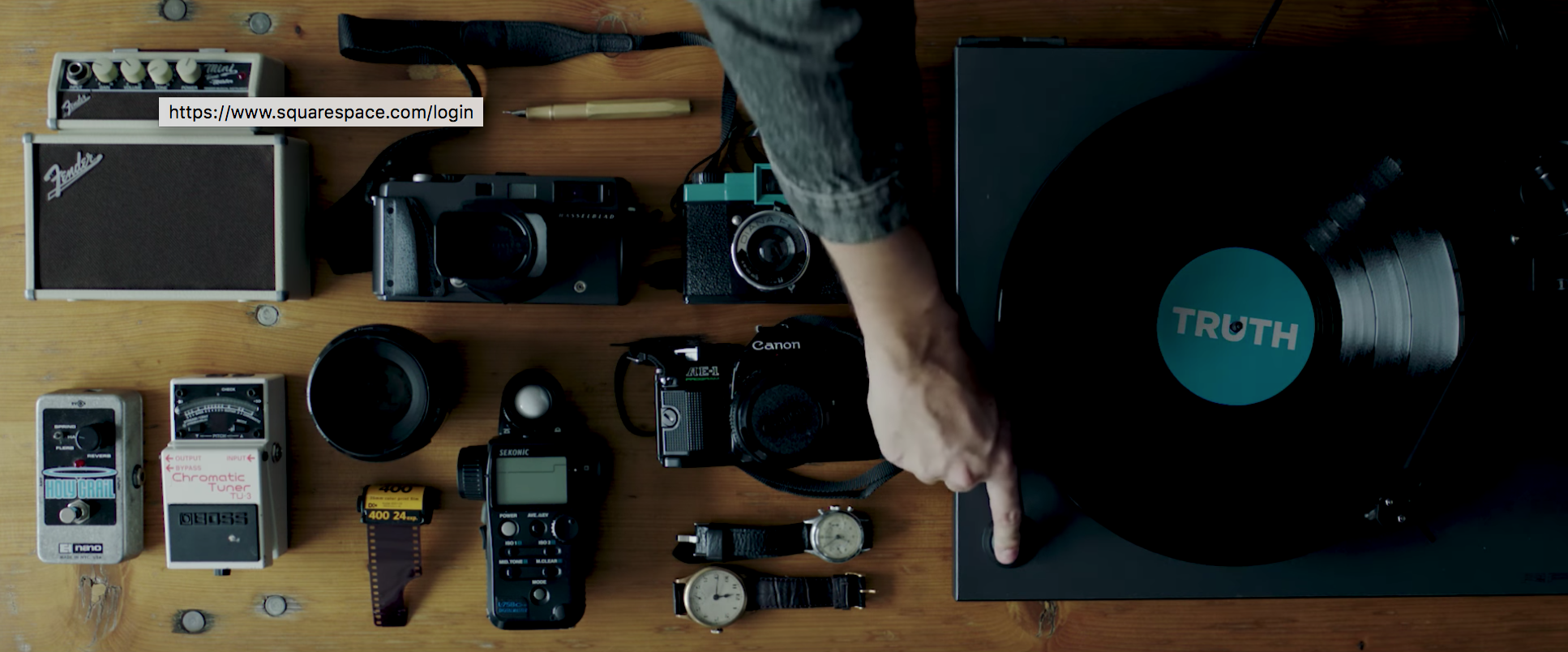
Notice this shot at 0:41-0:43.
To make this shot, they possibly had to track down all these props from various places. (It's also very possible that someone could have already had it all.)
I love that the record says "TRUTH" in light if the meaning of Vero. Did they make this sticker for the video? There's also a chance they happened to have a record titled Truth. Regardless, it's a great subtlety.
Here's the big question: as a filmmaker, are you willing to go through this much detail for a shot that is less than 3 seconds in the final edit?
6. The script is great.
Framed as a story by introducing a setting ("the last decade...") and then the main character ("we started with a name. Vero.") they effectively draw me in and give me a sense that we're going somewhere.
It's not just a story about them and how cool they are. It's a story about how Vero benefits me. How they take away all the stuff I hate about social media and distill into one place all the things I love.
Do they talk about the features? Yes, but always in a way that benefits the user. This is what effective advertising does. Tells you the feature as it relates to the customer's benefit. Customers don't care how you built it, which designers you used, or how hard you worked. They care that they won't see ads anymore. They care that they can have control of their audience and curate the things they love.
They bring it to a nice close by telling me why I should care:
"...it turns out, once you strip out the advertising, clean up the feed, and put control back in the hands of the user, you're free to be honest; be open; be provocative; be obsessed; and be yourself."
Synopsis
The crew who made this video have a strong grasp on the 2 things that make a good video for business:
Effectiveness - it communicates well.
Aesthetic Quality - it just looks and feels good.
People can bear with an effective video that isn't aesthetically pleasing, but videos that are high in aesthetic quality without being effective are doomed. They won't be remembered, and they probably won't impress anyone now except fellow video nerds.
At the same time, aesthetic quality must be a priority for filmmakers, or they won't use the medium to its full potential. Good video is not meant to simply transfer information. It's meant to make you feel something too.
Most videos fall on one side of that continuum (communicating info <---> creating a feeling). This video in inspiring because it strikes a delicate balance between the two that is sometimes hard to find.
WHAT DO YOU THINK?
Is there something you love about it that I didn't point out? Is there something about it you don't like.
Leave a comment below and let me know!


